Web Style Guide

Seton Hall University’s graphic standards manual is a resource for all members of the University community and the vendors who work with the University.
It was designed to ensure consistent and appropriate use of the University’s web style standards. The guidelines included represent of the University guidelines related to any and all graphic representation of Seton Hall University on the web.
Colors and Font
Web Color Palette
|
Main SHU Blue |
|
|
Main SHU Blue with Transparency |
|
|
SHU Navy |
|
|
Cyan Accent |
|
|
Orange Accent |
|
|
Silver Accent |
Fonts and Sizing
The official typeface of the Seton Hall University website is Tisa. Tisa is a serif font, available from the Adobe TypeKit library of fonts. It can be installed locally, or loaded via the Adobe TypeKit system. The only other font installed on the university website is Franklin Gothic, which is a sans serif font reserved for infographic use.
Adobe TypeKit: FF Tisa Pro "ff-tisa-web-pro": https://typekit.com/fonts/ff-tisa-web-pro

|
Headings |
|
h1. This is a very large header. |
font-size: 2.25 rem |
h2. This is a large header. |
font-size: 1.875 rem |
h3. This is a medium header. |
font-size: 1.6875 rem |
h4. This is a moderate header. |
font-size: 1.4375 rem |
h5. This is a small header. |
font-size: 1.125rem |
h6. This is a tiny header. |
font-size: 1 rem |
| This is a normal paragraph size |
font-size: 1 rem |
Logos and Usage
University Logo
The cornerstone of the Seton Hall identity is a set of "consumer" marks that makes use of the "Seton Hall University symbol" with the University logotype. The Seton Hall University logos will appear most commonly on white (or very lightly colored) backgrounds. For web banners and "on-color" appearances, an inversed white version of the logo can be used on a blue (#004488) background.

Two-Line Rect Univ Logo.

Two-Line Rec Univ Logo on a blue navigation bar.

University Symbol
![]()
One line Horizontal Logotype
The two-line rectangular brand should be used for all banners on web pages/web services on a blue (#004488) background where spacing allows it. For navigation bars and headers that don't allow much vertical space, the thinner one-line horizontal logotype should be used.
Secondary Branding
Secondary logos have been designed for Seton Hall’s various schools, colleges, divisions, etc. These logos will appear most commonly on white (or lightly colored) backgrounds, or in a reverse white on a blue (#004488) background.
Secondary logos are reserved for main departments and colleges at the university, and should only be used on officially sanctioned pages for that school. When in doubt, use the main Seton Hall University brand.

Secondary Logo for the Business School

Stillman School of Business Logo in a Blue Bar
Header and Footer
Header
The Seton Hall standard header is a 146px tall blue bar (#004488) to place at the top of all official university websites. It was designed keep the university brand consistent across departments, colleges, and vendors while still providing access to main University resources.
For internal use, the bar features drop down menus for each of the main links in the nav. When used with a third party vendor or a site outside of the main scope of the university, the dropdowns are removed and the items become static links (i.e. Admission links to shu.edu/admissions).
The main university header must always contain the two-line horizontal main logo brand.
Logo Available at: http://www.shu.edu/images/university-logo-desktop.png

Main University Header
Footer
The Seton Hall standard footer is a 246px tall blue bar (#004488) to place at the bottom of all official university websites. It was designed keep the university brand consistent across departments, colleges, and vendors while still providing contact information and important links. The bar should also include links/icons to the main university social networking accounts.
For internal use, specific departments/colleges can add their specific title and contact information to the left side of the footer.

Main University Footer
Images and Media
Images
For Seton Hall websites, we use authentic photography only. AI‑generated images, illustrations, obvious composites, and photos altered to look non‑photographic are not permitted. Light, factual edits are fine. Please choose an approved photograph from the University Photo Library or submit a photo request.
Images used on the university web page, should be 72dpi and the appropriate size/width to properly fill the space without appearing pixelated. If an image is grainy/or pixelated, a larger alternative should be found.
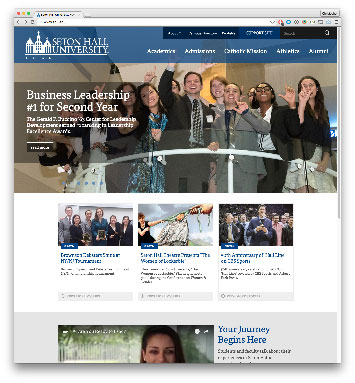
For accessibility reasons text should NOT be placed and rasterized within an image. All text should be rendered on the web, and overlaid over the image so that it can be properly read by screen readers and other services. The Gateway image below on the university home page is a great example of text overlaid onto an image, using real text on thru style
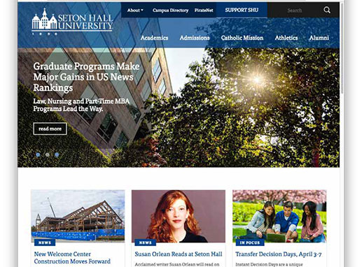
Gateway and News Image examples
Image Sizes
The following is a list of the standard image sizes used throughout the university website.
- 320x180 - News, In focus, Media hit (Images seen on the home page, in the “box render” style stories.
- 222x222 - Square profile and aside content (Used for profile images and content appearing in a sidebar)
- 940x335 - Content Header (Used as a header image on a standard content page)
- 1280x550 - Program Page Hero Image (Hero Image used on program pages)
- 1280x660 - Gateway Slider (Images used on the main shu.edu gateway slider)
Content Display
Displaying Specific Types of Content
Through the web redesign, Seton Hall University has developed a few standard ways to display specific types of content and media.
Media Box Render
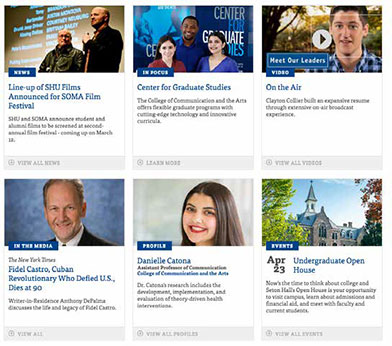
The "media box render" provides a visually appealing way to arrange dynamic content, with links out to full pages.
The images are standardized at 320px by 180px.
This style of box can be used for NEWS, MEDIA HITS, EVENTS, PROFILES, and VIDEO as seen here.
Profile Panel
The profile panel provides vertical box perfect for linking to and listing university profiles. The box features a 222px by 222px image, Name, department, and a link to the profile.

HTML Templates
HTML templates from outside vendors
The Seton Hall University Web team can provide HTML templates for outside vendors and organizations to use when incorporating their site or product in the Seton Hall style. These templates contain the necessary styles and links to match the look of a secondary university web page.
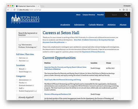
The templates include Header - Footer, and an open content area for implementation. An example of this can be seen at the University's career listing page at:
Contact webmaster@shu.edu for more information.
